Brown walls in the interior, tips and ideas for design.
Agree, brown walls in the interior are quite rare. But I would not jump to conclusions that using this color for walls is strictly prohibited. If you have such a desire, then go for it! But remember that brown or chocolate color walls will put you within certain restrictions regarding the design of the rest of your interior design. Next, I want to describe in detail how to use brown wallpaper for walls in the interior, focusing on which you can create a small masterpiece.
Brown color for walls, combination
When considering whether to paint your walls brown, consider the fact that this shade can greatly darken the room. But only if natural light in the room is in great short supply. Unfortunately, in modern apartments and in the houses of our country there is not much light, so make all the walls in brown tones I would not recommend it in the kitchen or living room. Instead, you can paint one wall or a niche chocolate (or wallpaper the walls in brown). As for the remaining walls, they must certainly stabilize the situation. To do this, paint them cream, milky white, pastel pink or pastel blue. Chocolate can also be actively used in additional accent elements, for example, a chocolate cape on a chair or chocolate stripes on curtains.
Brown walls in the interior and other colors
Consider using a combination of brown and one of the rich colors. You can look at modern clothes, which are used to wear especially glamorous things, to understand general principle. You will be able to achieve a juicy picture if you add rich turquoise, rich blue or hot pink to brown. The floor of the living room should be as light as possible. I would even recommend using some kind of white covering, such as carpet, unless you are afraid of problems with its maintenance.
And in general, since brown is no less rich in all respects than pink, blue or turquoise, I advise you to use more white inserts in such interiors so that the picture does not look too cloying. You can read more about how to properly combine brown with other colors here:
Brown walls and light furniture
I think this rule will seem logical to everyone. Dark furniture against the background of a brown wall, it will not only blend into the overall picture, but its mass will also darken the chocolate even more, which, on the contrary, must be lightened by all means. Therefore, we use exclusively light furniture that will contrast with the wall. White chair, white vases, white lampshade on the floor lamp. And if, at the same time, your furniture also belongs to the retro style, then the impression of your interior will be simply incredible. Brown color in in this case I would recommend taking the deepest and warmest one to achieve maximum effectiveness.
Design tips and ideas
Using the example from light furniture, build contrast based on less significant elements, that is, accessories. They need to be placed in such a way that the chocolate reflects the accessories in the most favorable color. For example, if against a brown wall there is a white coffee table with a white vase on it, it will look chic. You can lean a white guitar against the wall if the style of the room allows it. By the way, in addition to white, in the chocolate room you can use Orange color, which has excellent compatibility with the base.
Otherwise, do everything possible to make your room look as cozy, warm and humane as possible, especially since the brown shade is very conducive to this.
-

Design of curtains for the bedroom - types, styles and beautiful new items.
-

Turquoise interior, combinations of turquoise with other colors, photos.
-

Blue-blue color in interior design, shades of blue and blue.
-

Design of a children's room for a boy, photos of interiors.
-

Design summer gazebo For country house, photo.
Brown color in the interior is the personification of comfort, safety and coziness. Designers consider this color to be as indispensable as basic white. According to Feng Shui, brown belongs to the element of earth and symbolizes staticity and constancy. Psychologists claim that it has a calming and relaxing effect.
Important! Brown is not spectral, it is obtained by mixing green and red or orange and blue. Therefore, it is best combined with natural, natural shades.

Brown has many shades, absolutely not similar friends on a friend. According to the palette proposed by Pantone, there are 195 of them. The most popular are:
- Chocolate.

- Red-brown.

- Coffee.

- Walnut.

- Coffee with milk.

- Red-brown.

- Cognac.

- Caramel.

- Terracotta.

- Wenge.

Dark shades of brown give the room a touch of mystery and look more luxurious. They must be used following color rules, since visually they reduce the size of the room.


For interior decoration, use no more than 3-4 shades of brown. Emphasize different textures, designs, patterns. With brown it is very easy: raw or varnished wood, leather, natural and fake diamond, wallpaper and tiles imitating natural textures, wicker elements.


Rules for using brown in the interior
Many consider brown to be a classic warm tone, but it also has cool shades: wenge, taupe, dark chocolate, etc. Such tones are recommended for use in well-lit large rooms. In small rooms - perhaps as accents.


Light shades will help expand the space: coffee with milk, golden brown, milk chocolate.


Nuances of using brown color in the interior
- This is a neutral tone that does not seek to attract attention or dominate. It can be simply a background for another color in the decor, or a fundamental element.
- Brown is considered a natural color and is therefore well perceived by human vision. An interesting fact is that no matter how much brown there is around us, we practically do not notice it. Psychologists say that a brown interior promotes decision-making and has a calming effect.
- Brown is a universal color. Along with gray, white and black, it is considered basic, as it can be combined with almost all shades.
- Brown “loves” multi-level lighting and a variety of textures and textures - this makes it look more rich and interesting.
- An interior designed only in brown tones may seem boring and faceless. Needed bright accents.
Using brown color in different interior styles
Classic style
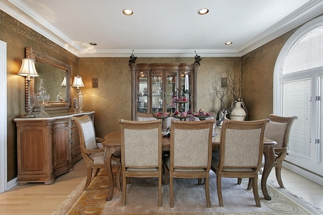
Designers say that most often reserved people prefer brown interiors. Brown looks very noble and expensive, so it is indispensable in a classic interior. It's important to choose natural materials! Plastic (even if it imitates wood) is simply inappropriate. Accessories in white, orange, beige, burgundy, and black will help “dilute” the severity of brown.


Country
Unlike the classics, where glossy and varnished surfaces, in a country style interior it is better to use matte shades. Use 2-3 shades of brown - this way you can visually adjust the room and place accents. Deliberately rough shapes, more natural untreated wood, checkered and floral prints - this is the “recipe” for the perfect country style.


Eco style
Cozy and as close to nature as possible. Brown can be accompanied by grassy, salad or olive green, white, beige, orange. Accents made of wood, bamboo, natural stone and other textured materials.


Minimalism
A good solution for a room of any size. Choose cool shades of brown. They go well with sandy yellow, beige, gray, and turquoise. Use no more than 2-3 shades, the emphasis should be on visual extension space and functionality.


Japanese style
The Japanese live in harmony with nature, so when arranging the interior they use only natural shades and materials. Raw wood, wicker mats, bamboo, simple decorations - these are the attributes of this style. Try playing with contrasting shades of brown.


Scandinavian
The leading role in this style is given to white and beige color, but there is also brown. You can make the interior more catchy by adding a chocolate shade or wenge, or you can visually soften the interior by choosing walnut or coffee brown. Focus on deliberately rough and untreated surfaces.


Loft
Brown goes well with grey, white and beige, which are the basis of this style. Rough boards on the floor, ceiling wooden beams, furniture - the role of brown is accentual, but it gives the room a special coziness and warmth.


Victorian
Rich and catchy style. To pair with brown, you should choose gold, beige and burgundy. You can use 2-3 shades of brown (for example, coffee with milk and wenge), delimiting them with moldings. It is better to choose not matte, but glossy shades- they look richer and more interesting.


Combination of brown with other colors in the interior
The good thing about the brown palette is that it does not differentiate, but rather combines different shades into a single whole. The huge advantage of this color is its combinatory nature and versatility; it is compatible with almost all shades.
Table of successful and unsuccessful combinations of brown
|
Design tips |
||
|---|---|---|
|
Classic, Baroque, Victorian, Loft |
These shades belong to the same color palette and balance each other. The interior is pleasing to the eye, and you can diversify it with bright accents. |
|
|
Orange |
Eco-style, Modern, Oriental |
Use orange as accents. It goes best with dark shades of brown. |
|
Country, English style, Japanese |
These are related colors. If you don’t like bright red, choose muted tones - wine, burgundy. |
|
|
Eco-style, Minimalism, Ethno, Oriental |
This interior promotes relaxation and looks as natural as possible. Choose natural shades of green - pistachio, olive, salad. |
|
|
Marine, Country, Mediterranean |
The highlight of this interior is stylish prints. Both brown and blue are great backgrounds for interesting furniture and accessories. |
|
|
Loft, Minimalism, Fusion, Scandinavian |
It is important to choose a darker shade of brown so that the surfaces do not merge. Don't be afraid to use supporting colors. |
|
|
Modern, High-tech, Provence, Eco-style |
Brown and white are a light and contrasting tandem. Use several shades of brown. |
|
|
Shabby chic, Provence, Pop art |
To prevent the interior from being too glamorous, use complex shades of pink - ash rose, fuchsia, carmine. |
|
|
Turquoise |
Provence, Minimalism, Marine style |
Use 2 shades of brown or choose a secondary color. Turquoise makes the interior moveable, while brown makes the interior static. |
|
Unsuccessful combinations of brown |
||
|
Violet |
The interior turns out gloomy and depressing; you don’t want to be in such a room. |
|
|
Acid shades |
They don’t go well with natural brown; they need a light neutral tone. |
|
The best ideas for combining brown with other colors in the interior
Many people think brown is a dull color, but they just couldn't match it the right pair! Brown color goes well with different representatives of the color palette:
- Neutral shades (these are background colors - white, beige, gray).
- Contrasting colors(against his background they look even brighter).
Brown and blue
Brown is a rather static color, while blue gives the interior mobility and expression. To prevent the room from seeming too gloomy, use a third color - turquoise, beige or white. Matte shades of blue look more interesting - they add a touch of mystery and nobility.


Brown and white
This is a classic combination, but choose sterilely White color Not recommended. Note creamy, milky white, ivory. You can add dynamics to the interior using voluminous textures and bright accents. White should dominate, the ideal ratio with brown is 60:40.


Brown and green
Green and brown are a combination that is as close to nature as possible. Such an interior has a beneficial effect on the nervous system and promotes relaxation. Bright herbaceous shades will help make the room more expressive, while olive and marsh shades will help make the room more expressive. Green can be both an active color and a soft background color.


Brown and gray
Gray color often acts as a background for brown furniture. It creates a light and pleasant contrast and does not bore you with an abundance of colors. Bright accents or voluminous textures - prints, 3D panels or tiles, imitations - can add sound to the interior. brickwork, wood, concrete. To prevent the room from seeming bulky and heavy, avoid massive furniture.


Brown and beige
For designers, this color scheme is considered a win-win option. Brown and beige are wonderful partners that complement each other. Beige brings light and softness to the interior, brown - static and a certain brutality. This tandem is good even without bright accents. Will help make the room more expressive accent walls, panels, textured finishing materials.


Brown and yellow
Yellow is one of the most bright colors in the palette, so it’s important not to overdo it with it. But it brings a “piece of sun” even into the darkest rooms! If you want a calmer interior, choose mustard, canary and orange-yellow. Bright lemon and sunny yellow are best used accentually. White, olive, blue, gray, and beige harmonize with this combination.


Brown and red
Considered traditional English combination. It is important not to use a lot of red, otherwise it will create an oppressive impression. Calm shades of red - marsala, mahogany, carmine, burgundy - will help soften the interior. Red itself is a rich color, so there is no need to use an abundance of prints and textures.


Brown and pink
This combination may seem unexpected and a little childish, but it is important to choose the right shade pink. This is a romantic and relaxing tandem, which is considered favorable for nervous system. Faded shades of pink look more noble, bright shades like fuchsia or purple-pink bring a touch of joy and revitalization to the interior.


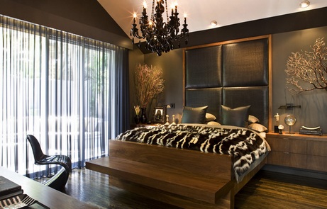
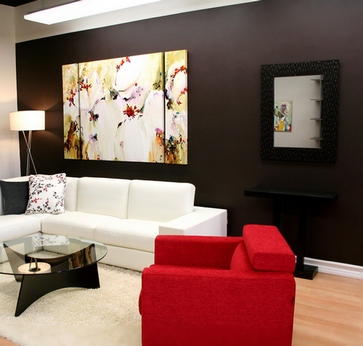
Brown and black
Controversial but stylish combination. Your task is to choose the right shade of brown (focus on a light palette) so that the room does not turn into a dull box. It is very important that there are several light sources in the room and correct zoning. If desired, you can use bright accents - white, yellow, orange, red, beige.


5 advantages of brown color in the interior
- Naturalness. Brown is appropriate in any room; it brings a touch of comfort and warmth. The brown interior will appeal to people of all ages!
- Many shades. If you wish, you can decorate the room only in shades of brown, and it will not be boring or dull! The palette is very wide: from coffee and caramel to wenge and red-brown!
- Practicality. Brown interiors They do not lose their attractiveness for a long time and are easy to care for. However, we must not forget that dust is more noticeable on dark floors and furniture.
- Versatility. Brown can be both a wonderful background and a catchy accent! It goes well with warm and cool shades. Even novice designers are unlikely to make a mistake!
- Always in fashion. This color surrounds us everywhere, we’re just so used to it that we hardly notice it. This is an excellent solution for both modern and classic interiors.
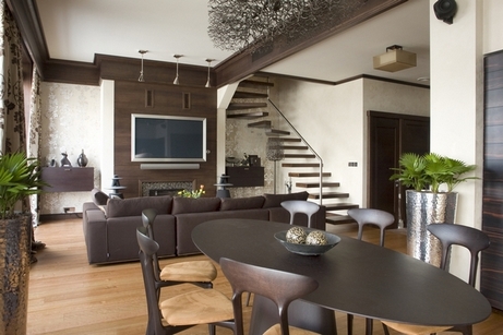
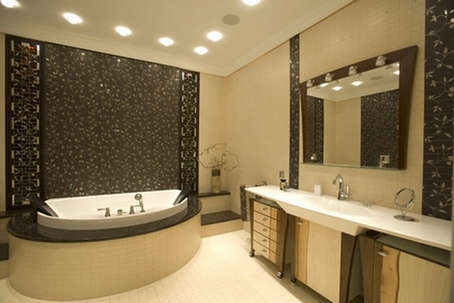
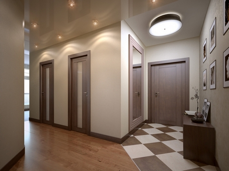
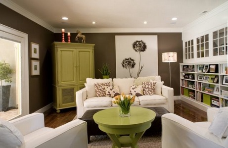
Photos of interiors in brown color


The interior in brown looks very stylish and noble! And you can dilute it with unusual textures and bright accents!
See also:
Brown warms!
Brown is a very natural color for building interiors. After all, this is the color of wood - a material that has always been actively used both in the construction of houses and for the manufacture of furniture. The emergence of new technologies and materials has allowed people, if desired, to completely displace brown color from interiors. Now in some houses (for example, in Scandinavian style) you may not find anything brown. However, the craving for this color and texture of wood is inescapable. Brown makes a home cozy and warm, while always remaining neutral, without overpowering or stealing attention.
Psychology of brown: meaning and perception
The word “brown” in our language comes from the words “bark”, “cinnamon”. That is literally the color of the bark of a tree. However, it is also the color of the earth, soil, autumn grass and leaves, very dark skin and the fur of many animals. This is the most natural color that surrounds us everywhere.
This is also due to its psychological impact. Brown color calms, gives a feeling of security, and promotes the prevalence of common sense. A large amount of brown in the interior helps to make calm, informed decisions.
Brown floors and furniture give a feeling of stability and stability. “Comfort” is the main word that can be used to describe interiors in brown colors.
Brown is good for the interiors of those people who, due to the nature of their work, are forced to spend a lot of time in bright, colorful places or constantly move, change “places of deployment”, meet with big amount of people. This color in the interior is also suitable for those who work or have fun in places with loud music, multi-colored decoration, and illumination. Brown will allow you to fully relax psychologically and be filled with new strength.
Psychologists note that brown color is often chosen by people who need mental rest and detachment from bustle and worries. Those who are in search of ways to express themselves, own style and things to their liking, they reject brown. Thus, the predominance of brown in the interior can be recommended to accomplished, self-sufficient, self-confident people.
For a long time, brown color was part of the group of so-called “elegant” and “respectable” colors, which were preferred by rich people and representatives of the highest circles of society.
Brown color in the interior: where and how?
Brown color can be actively used in any room: kitchen, bathroom, hallway, living room, bedroom, etc. However, there are certain nuances. After all, brown is a dark color. If the room is small, a large number of dark surfaces will make it gloomy and even more compact in feel.
This does not mean at all that brown tones are contraindicated in a small bathroom or small bedroom. It’s just that the smaller the room, the more light shades you need to include in combination with brown. If it gets boring, add some bright accents of one of the “juicy” colors.

Since brown has many completely different and dissimilar shades, choosing the right tones, you can slightly correct the shortcomings of the room and create the desired mood. So, for example, if the room is cold and gloomy (the windows face north side), it is worth giving preference yellowish light brown. If you want the room to be cheerful, you should choose reddish brown and tan tones.
Dark chocolate brown will make the room luxurious, expensive in appearance, with a flair of mystery.

Dark shade of coffee with milk is able to endow the interior with such features as coldness and “impassion.” Good for relaxation.

If a lot of brown color is used in the interior, it is necessary to introduce different textures, textures, and patterns. If everything is glossy and smooth or matte and velvety, the eye will have nothing to grab onto. The room will appear blurry, faceless, and uninteresting. It’s easy to play with brown textures: this is wood of different shades, and silk fabrics, and brown stone or, and leather. And also upholstery, skins, as well as wallpaper and panels imitating natural wood, mats, and wicker.


As you can see, brown favors the predominance of natural (or pseudo-natural) materials in the interior. Brown itself is calming, and natural textures bring harmony. That is why interiors in brown tones, unlike many other color schemes, are attractive to most people.

What to combine brown with in the interior?
The best partners for brown in the interior are “caramel” shades, orange tones, and green. And, of course, having white next to brown will always come in handy.
Brown color in the interior combined with caramel tones. Light shades - beige, cream, cappuccino, ivory, champagne, etc.- perfectly shades brown. This contrasting tandem is truly flawless.

If against a white background brown seems too dark and rough, then “caramel,” on the contrary, softens it, emphasizing warmth.

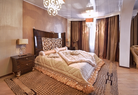
Beige-brown bedroom
Brown and beige living room
This combination often turns out “delicious”, reminiscent of chocolate cake with cream or other masterpieces of a confectioner. That’s why accents of fruit and berry tones fit perfectly here: red, lingonberry, raspberry, plum, apricot, pink.

However, it is not at all necessary to include bright accents, because caramel-brown interiors, with a variety of textures and patterns, are absolutely self-sufficient.
A brown-cream or brown-beige combination is an excellent choice for the bathroom and toilet, as well as for the hallway, that is, for small rooms. As already mentioned, the absolute predominance of brown will make a small room gloomy and oppressive. But the interweaving with “caramel” will allow you to create a warm, cozy and quite cheerful interior. The combination of brown and beige (cream, cappuccino, Ivory) tiles on the floor and walls.

A combination of brown and orange. Brown and orange make the interior bright and hot. It can resemble a summer garden with trees laden with apricots, peaches and other orange berries. However, it can also look like an autumn park with “burning” leaves. Brown-orange interiors are fresh and rich. They seem to have a garden-park aroma.

The darker the brown surfaces, the more effective the combination with. Orange and brown can be combined in wall decoration, furniture, curtains, and accessories. That is, both of these colors can be almost equivalent masters of the interior.

However, other solutions are possible. Only one of these colors can predominate, but the second will be a wonderful addition. Have you bought an orange kitchen and don’t know what pieces of furniture, decoration and accessories to complement it? Look towards brown.

When bringing these two colors together, it is worth using a “bridge”, which is best suited to white. It will become an excellent background that will most fully emphasize the depth of each color. White will not extinguish them, but on the contrary, it will allow you to express yourself in all its glory.
You can choose the same “caramel” as the background, but it will mute both leading colors. If this is exactly what you want, then the choice is obvious.
Brown color in the interior combined with green. This tandem is less bright and impressive. Brown-green interiors, as a rule, do not amaze or delight. They have a different role. Brown and green, whether the designer wants or not, create an environmentally friendly interior. This is understandable: green and brown are the colors of forests, fields, meadows.


The interior in these colors turns out fresh, a little cool. It’s even easier to breathe in it, since it’s quite difficult to avoid association with nature. If you want to achieve just such an effect, that is, create an interior in eco-style, you should pay attention to the selection of materials, textures, textures. More wood, natural finishes, living plants and natural motifs in ornaments, designs, and decor.

Interiors in brown and green tones are also called interiors for the soul and meditation. Meditative interior? Why not?
Above we looked at the most advantageous and common combinations of brown in the interior. However, there are still some interesting opportunities to use this color effectively and beautifully.
Combination of brown and white in the interior. It has already been noted that against a white background, brown can look rough and, in some cases, even dirty. But this can be avoided if you combine several different shades of brown in one room - from dark beige and walnut to chocolate brown and wenge. It’s worth playing with textures and textures of surfaces. With this approach, combining only white and brown, you can get quite contrasting and graphic, but at the same time quite soft and cozy interior. If desired, it can, of course, be diluted with bright accessories - for example, orange, red, green.

Brown and white interiors
Brown and red in the interior. Brown and red get along well together, but not in a duet, but in a trio. The third color is either white or one of the caramel ones. With such a trio, the interior can turn out to be catchy, impressive and very appetizing, like strawberries and cream, drizzled with chocolate glaze.


Brown for a luxurious interior: combination with gold, silk, mirrors, glass, fur. It has already been mentioned that brown in former times was considered the color of the rich and people from high society. Therefore, brown is often found in magnificent interiors, characterized by an ostentatious desire for excess and deliberate visual high cost. Firstly, brown is calm and restrained, and therefore does not allow the interior to become too pretentious. Secondly, brown is the color of wealth.

It is in perfect harmony with furniture and decor with gilding, expensive silk and velvet, crystal chandeliers and many mirrors in exquisite frames.

Interiors where brown is complemented with gold can be decorated with animal skins or fur pouffes and pillows. Genuine leather, even in excess, looks very harmonious here.

Brown with blue and pink. The combination with pink brings a retro spirit to the interior. This combination is often chosen for women's bedrooms and for. There is also something confectionery in the combination of brown and pink (a la cake with berry cream).


When paired with blue, brown can look quite bulky and dirty, so you need to be especially careful when choosing shades. Brown-blue interiors look “winter”, cold - they evoke an association with frosty freshness and cleanliness.


Interior from the Ikea 2013 catalog
What color is brown least often combined with in the interior?
Combinations of blue and brown shades are often found in nature - sky and trees, sea and mountains, earth and blue flowers on her. The ensemble of these colors is considered one of the most harmonious and favorable in clothing, makeup, and interior design. How to combine them correctly and in what interior to use them?
Shades of summer

It is interesting that such a color scheme will refresh the interior in summer, and in winter it will remind you of the sea and sun. It is universal for year-round use. To bring fresh notes into the space, you should turn to delicate combinations. For example, use sky blue as the main color, complementing it with pleasant shades of light wood, clay or sand. Or do exactly the opposite, swapping color schemes. In both cases the effect will be positive.


Noble combinations

Deep shades of brown and blue can make the interior look solid and presentable. Most of all, such combinations are appropriate in living rooms, offices and libraries. If velvet blue is used on the walls, then the room should not be cramped by a small area. This color loves space. The partner of noble blue in such an interior will be furniture in chocolate shades, poufs and armchairs from genuine leather, velvet decorative pillows.


In what interior are blue, brown and their shades appropriate?
Brown and blue are often found in nautical, ethnic and Mediterranean styles. Often pastel blue shades combined with muted beige and light brown colors are found in classic interiors.

In the loft style, a play of contrasts is also appropriate. For example, decorative blue pillows will harmonize perfectly with brown leather sofa and naked brick walls.

Also brown and blue, in the form of small accents, are found in Scandinavian interiors(furniture, decorative items, lamps).

Which room should I use it in?
Most often, the harmonious blue-brown color scheme is used to decorate living rooms, although it is considered harmonious for any room. Here she creates an incredibly cozy and comfortable atmosphere. It has a calming effect on the owners.

In the kitchen and dining room, brown is a frequent guest, but blue can suppress the feeling of hunger, so here it is used fragmentarily, as accents.


In the bedroom, combinations of brown and blue can be used in bed linen, on curtains, in furniture upholstery. This great option for seasonal interior renovation. but here you need to remember that bright turquoise shades can invigorate. They should be used in smaller quantities, drowning out their violence with a noble brown color.
No one will argue that brown color in the interior is solid, elegant and aristocratic. At all times, wealthy people have given preference to it when decorating their homes. This color is neutral, universal, and accepts bright, rich accents. Even in combinations with gilding, typical for, it remains calm and natural.
Color makes the environment comfortable, has a calming effect, creates a feeling of security, stability and stability. In a room where brown predominates, it is easier to concentrate and think about a decision.
This color is recommended for people who spend a lot of time traveling and, due to their occupation, maintain a large number of social contacts. If you have a busy work schedule, then you won’t find a better color solution. You will be able to fully relax at home, you will feel home warmth and comfort.
Shades of brown in the interior
Brown visually reduces space, so its dark shades are not recommended for small rooms. IN small room excess dark brown will make a depressing impression, so it is better to focus on light shades and add bright colors in the form of accessories.

When working with color, you should also consider the location of the room. If the room's windows face north, take yellowish or light brown shade as a base.
Ginger or reddish tint will make the interior cheerful, dark chocolate will look luxurious and rich, shade coffee with milk will retain a certain coldness and dispassion. Choose shades depending on the desired impression.

Play not only with shades, but experiment with different textures, textures and patterns. The list of materials available for work is limited only by the designer’s imagination: wood, fabrics, stone, brick, leather, as well as upholstery, skins, imitation natural wood, mats, and wickerwork.
Rich brown harmonizes with expensive materials beloved by classic fans: gold, silk, velvet, crystal, fur, as well as hides and leather.


What colors does brown go with in the interior?
Brown is truly universal and goes with almost any color. Let's look at popular and unusual combinations that also happen.
“Brown + caramel shades”
Beige, cream, cappuccino, shades of ivory and champagne form harmonious unions with the main color. Beige and cream are perfect for small spaces - the bathroom and hallway. Caramel tones soften and enhance the warmth of brown. The overall picture will be complemented by fruit and berry motifs in the form of red and pink flowers, lingonberry, raspberry, plum, apricot shades.

"Brown+orange/yellow"
Orange makes the interior bright and even hot, evokes associations with trees in summer garden or a park in the autumn season. The darker the base color, the more impressive the combination with orange will look. Similar color solutions you can see in ethnic interiors, for example, in Indian or Arabic ethno.
The third color in the pair can be white; it will balance the influence of bright orange and visually push the boundaries.
Yellow will add a touch of positivity and fill the space with vital energy. The combination of brown and yellow is often found in country and retro styles.


"Brown+green"
This pair takes an eco-inspired approach and creates a fresh, cool, meditative interior. The combination of basic brown with a mint shade of green looks great.


"Brown+white"
If you take white in its pure form, then brown against its background may look a little rough. Therefore, it is better to choose different shades of the main color - dark beige, walnut, chocolate, wenge. Experiment with textures, textures and accessories that can be orange, red or green.
White can be used to compensate for excessive darkness. For example, put a white floor lamp or other decorative element in a darkened corner, and the impression will immediately change for the better.

"Brown+red"
Another spectacular combination of brown in the interior is obtained with red. It can often be seen in the interiors of living rooms and offices, decorated in a traditional English style.
In this pair, white will also not be out of place. Try adding a hint of caramel for impressive results.

"Brown+pink"
These colors are typical for English style shabby chic and retro. The combination with pink is traditionally used to decorate girls' rooms.
You don’t have to take only the soft pink of a girl’s dreams. Bright pink accessories will liven up a conservative brown room and add a little glamor.

"Brown+blue"
On blue, the main color will look a little dirty, so you should carefully select shades. In general, the combination is successful, it gives the effect of winter coolness and emphasizes cleanliness.
Dark shades of blue in north-facing rooms are not recommended. They create a gloomy, oppressive atmosphere, but bright shades look youthful, interesting and stylish.
The combination with turquoise is a great option if you are decorating a room in a retro style. Turquoise brings back memories of the sea, sky, summer. If you add accessories from nautical style, then the room will turn into a ship rushing through the waves.

"Brown+black"
A controversial combination that designers usually do not recommend. If you don't have enough design experience, you shouldn't try this experiment. Indeed, both colors together look frighteningly dark and are associated with castles from vampire films. But similar color solutions still occur, only here there is always a third neutral color - white or gray.

"Brown+gray"
Another solution that is quite difficult to implement in the absence of experience and special knowledge. It's better to consult a designer. More often found in the design of work offices.

"Brown+purple"
The third pair, where it is difficult to build relationships between colors. Violet has a calming, even soporific effect, so this solution is unlikely to be suitable for the living room. But in a large bedroom it will look mysterious and enigmatic.

Brown in the interior of different rooms
There are two options for the hallway - either take light shades and thereby visually expand small room, or turn to rich, deep tones ( chocolate, cognac, cinnamon ), diluting them with white or adding reddish ones, which will create a hospitable atmosphere.
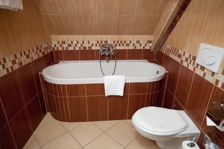
For a small bathroom, a lot of dark brown is not recommended. Take warm shade or beige , add light pink, blue or soft lilac .

In the kitchen interior, brown is a good alternative black . Combines with white and looks great with metal parts. If you chose country style, add beige and golden tones . In retro, warm colors look great against the main background. yellow, pink, blue, orange details.

In the office, brown helps to concentrate on work. It can be supplemented white , gray or beige , and dark red or chocolate accents.
The brown color in the bedroom interior is diluted with white. You can also add lilac, pink, turquoise or green .

It is better not to use dark shades for children's rooms. Give preference light beige tones and combine them with green, blue or orange elements.
See also:
♦ Category: .